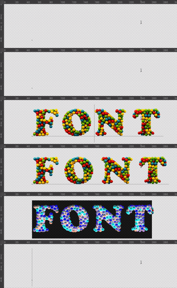
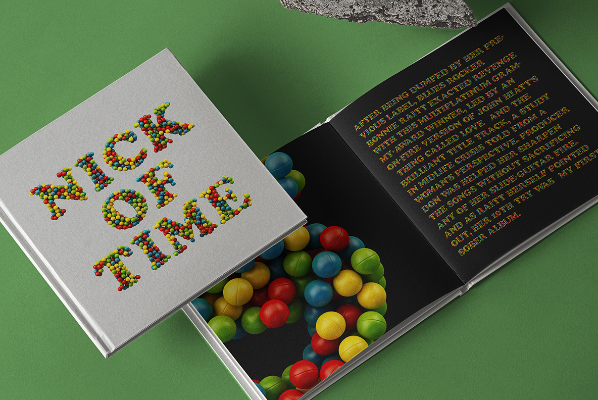
Red, yellow, green and blue plastic balls tipped into letter shapes, exactly the ones from a ball pit. They are glossy, slightly scuffed and piled several deep, so the colours land in a different order in every character. Nothing is arranged. That randomness is what makes it read as play rather than pattern.
Straight Out of a Ball Pit
These are, of course, the hollow plastic balls every soft-play centre owns. Red, yellow, green and blue pile several deep inside each letter, glossy on top and slightly scuffed where they have been handled. Because the balls sit at different depths, the ones behind fall into shadow and the colours darken. So the strokes get real body instead of looking flat. Naturally a few balls escape past the outline.
Why the Playroom Font Never Repeats
Colour order changes in every glyph, which is why the Playroom Font never looks like a pattern fill. Count the balls in an M and then in an N, and no sequence repeats. The letterform underneath is a wide bold sans with big open counters, since anything narrower would fill up with plastic. Above all the four colours stay evenly balanced, so no single hue takes over a word. Besides, the gloss gives each ball its own highlight.